Hi my name is Aoife. I am a 2nd year communication student in DCU. This blog is to help me track my progress on my photography project. I hope you enjoy the content that I post. :)
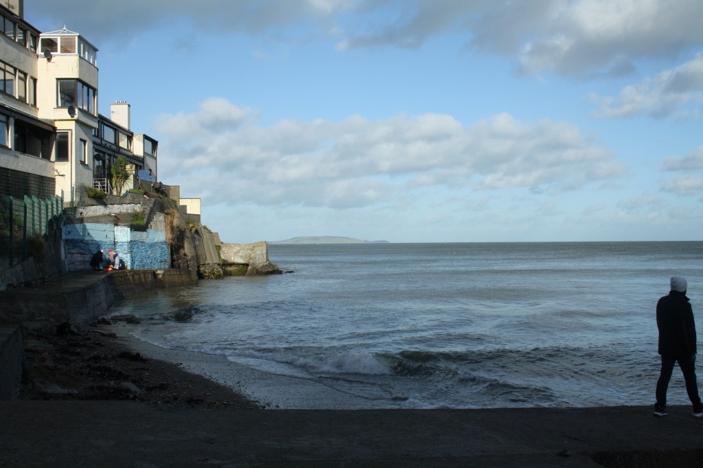
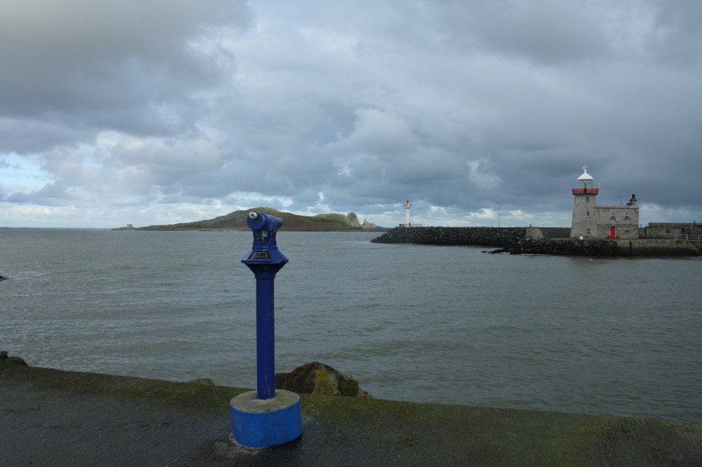
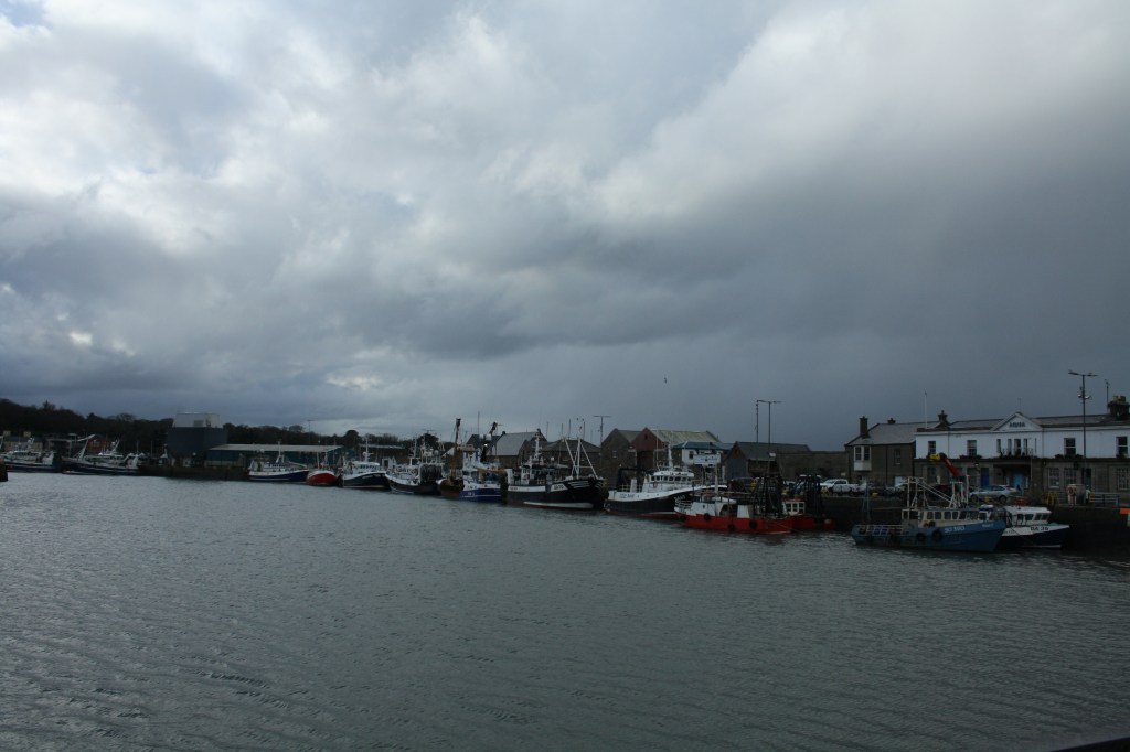
I have chosen the medium of photography to try to illustrate the beauty of the seaside town that I have been lucky enough to live in. I wanted to look more into the harbour and the recreational side of the town rather than the religious aspect. The harbour is where the majority of the village would have made their income for the first 100 or so years of Howth becoming an established town. Many of the fishing boats have been owned by the same families for generations. They have great pride in the craft and intended on keeping the tradition alive.
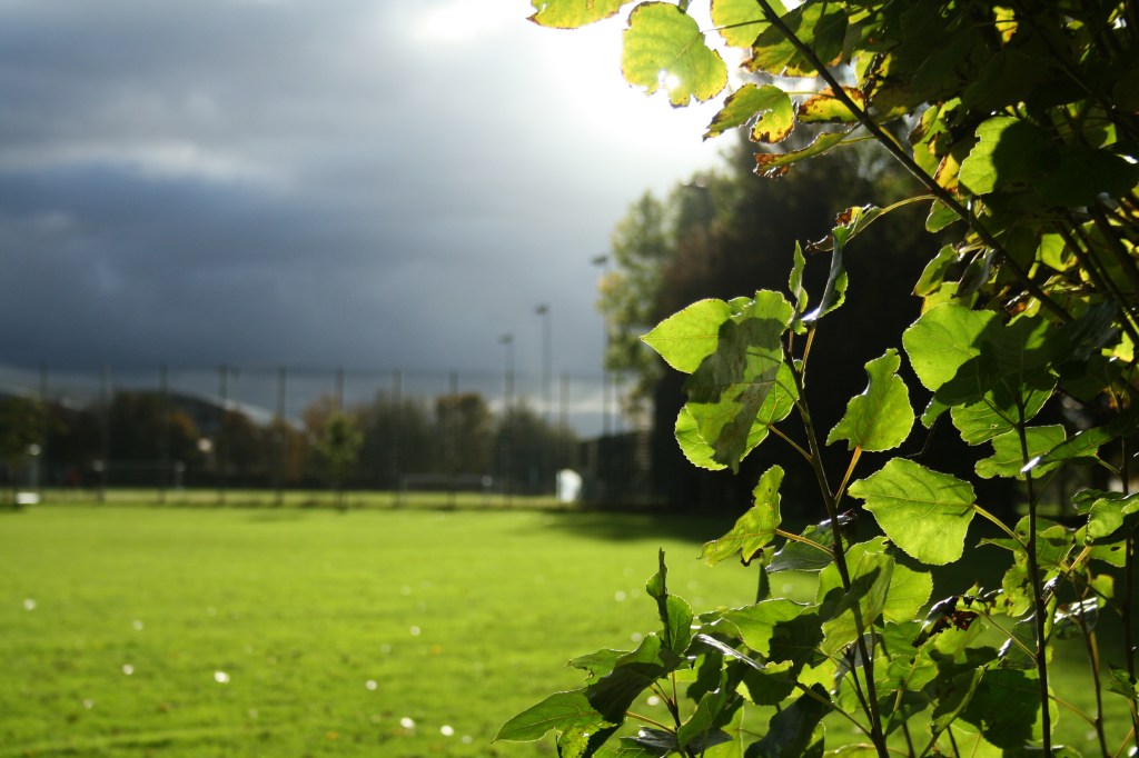
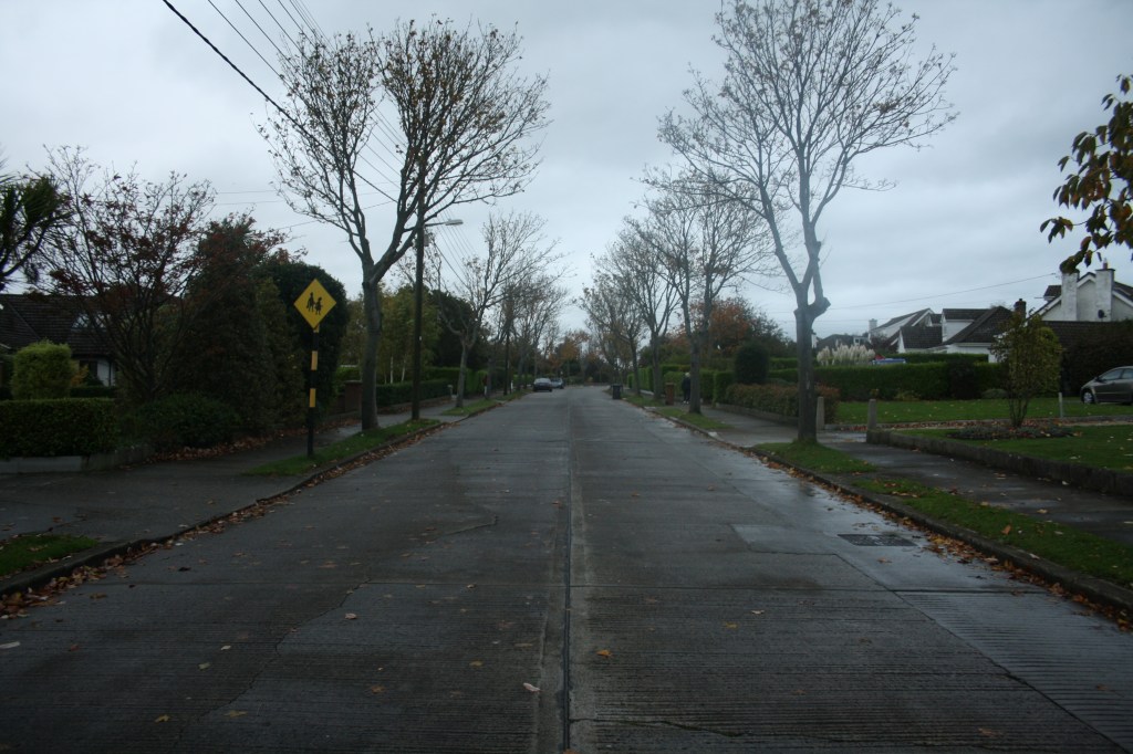
I would describe my photography as in-depth, showing the actual reality of living in a seaside town in Ireland. At this time of the year, there are seldom bright and sunny days. This year has been a partially dull and gloomy winter. Almost like the weather is depicting how everyone is feeling during this Corona Virus time. Many of my photos were taken before or after heavy rainfall, I’ve tried to find some photographs from the summer of Howth so that you can see the comparison of the lighting.
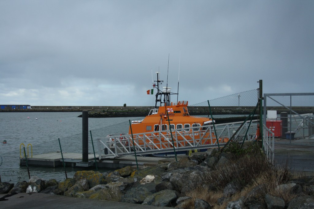
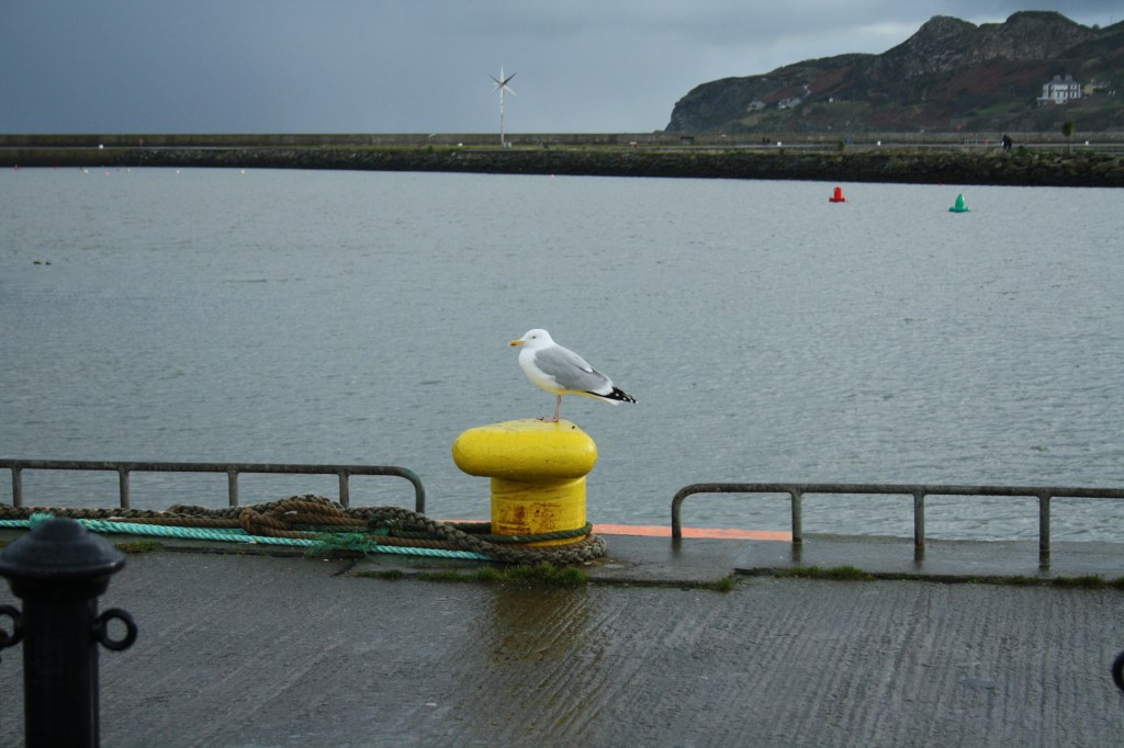
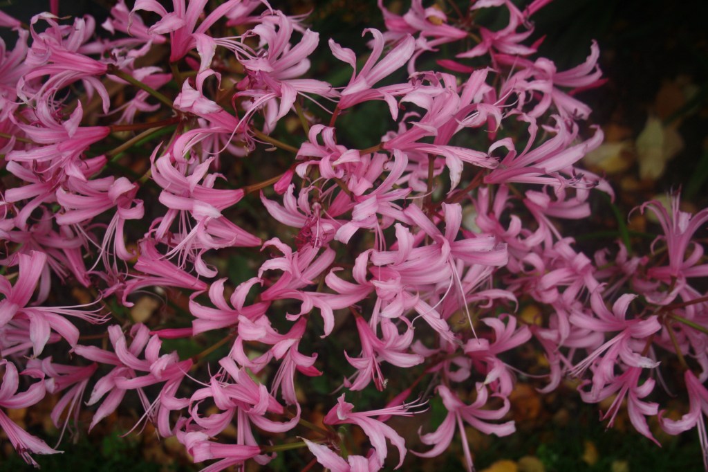
I tried to capture the colours of the habour as much as I could. Typically there are a few colours that are used over and over again in seaside landscapes and infrastructure. Colours like red and green indicate lefts and rights, red being left and green being right or port and starboard. There are also a lot of blues, greys and whites that would be mostly in the buildings. Every so often theres pops of bright colours from the vibrate orange lifeboat or from the different coloured spinkiers which is a type of sail. However there has been no racing recently so nobody has flown their spinikers for a long time.
I was hoping to show the true beauty of my home however the weather and my timings would never coordinate. That made me look at my project in a different light. It made me look for inspiration else where. My orginal plan was to photography the sunny Sundays with familys playing and getting ice cream. Lockdowns and freezing weather stroms prevented that vision from being captured. Although it made my job harder it made me look deeper into the area and not just the surface level of what is visually pleasing.
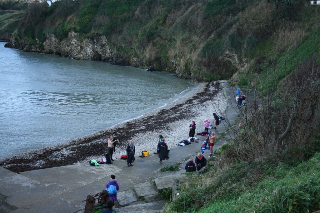
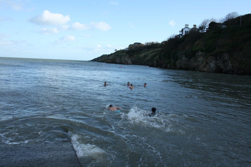
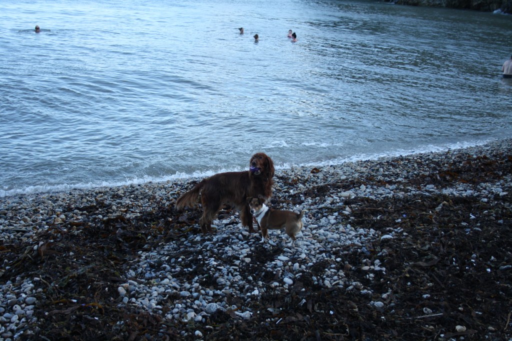
I took inspiration from the people who ventured into the freezing water everyday from some release as a form of exercise during lockdown. I looked at all the lighthouses and how the are still such iconic symbols of Howth even if they aren’t in full use today. I saw beauty in the seagulls which are typically hated by all the residents and the visitors. The set backs that my project faced made me appreciate the little everyday beauty in my surroundings. We take advantage of the beauty that our areas posess because they become second nature to us. This project reminded me of the beauty that my area has.
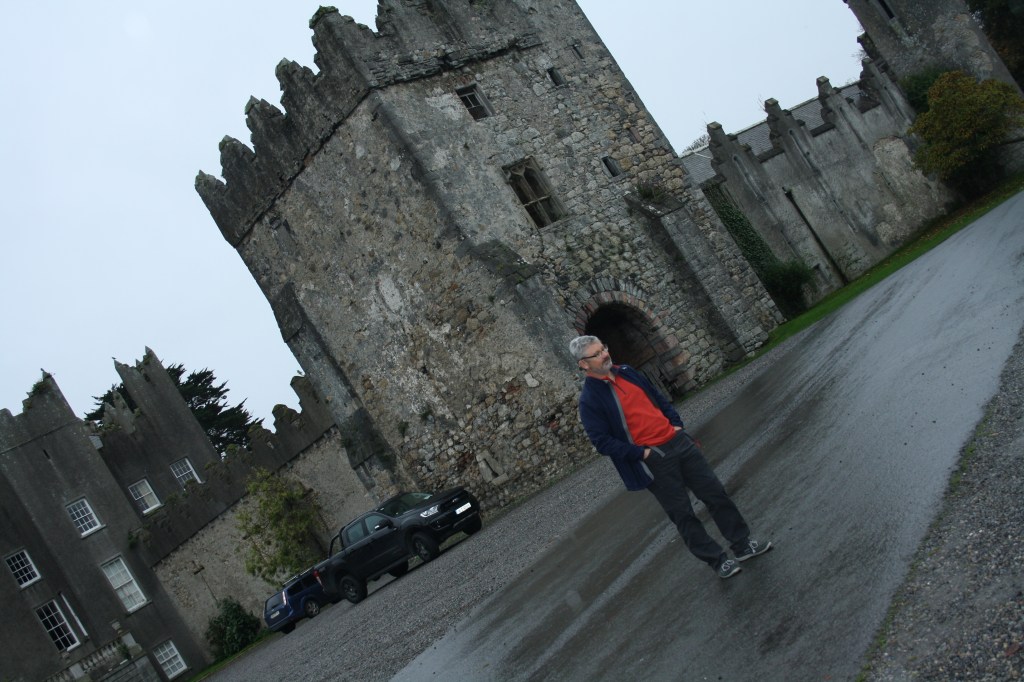
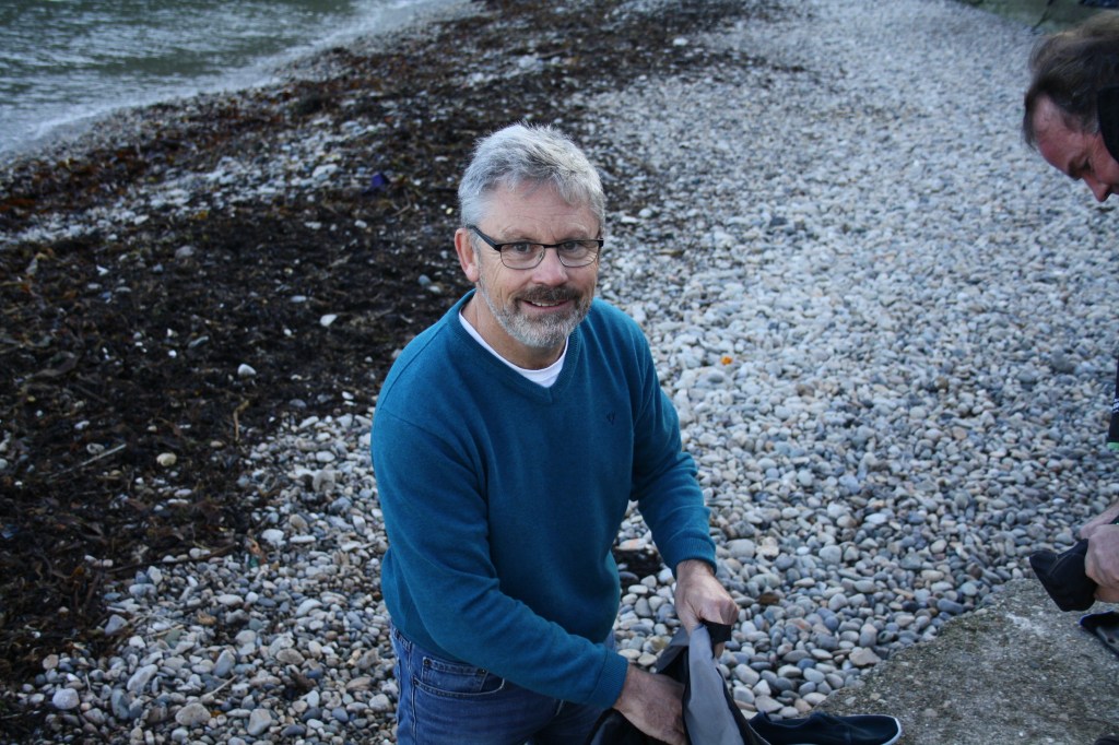
Howth castleSwimmers on Balscadden beachThe end of the 100 steps My dad pre swimSwimmers on Howth beachMy dad during his swimDogs waiting for their owners to finish swimmingIrelands EyeHowth lighthouse on a cold morningHowth Yacht Club Marine The old marineClouds under the BaileyIrelands eye from the top of Howth HillDombohill aka The rainbow hillThe one time we managed to go for a sailThe lifeboat in its launchThe seagull
What is the decisive moment and who came this term?
The decisive moment is a strategy that has illuminated photography potential. It refers to capturing an event that happens spontaneously. The image often represents the event that is unfolding. The French photographer Cartier-Bresson coined the phrase. His photography style is usually described as being in the right place at the right time.
2. Who was Robert Capa and what was he famous for?
Robert Capa was born on the 22nd of October 1913 in Hungary. He became one of the most famous and recognisable photo journalist during World War 2. Many people disagreed with how he was depicting war because they felt as if he was attempting to romanticise war. He was known for risking his life in an attempt to capture the true reality of war. His most recognisable photograph is called Death of a Loyalist. He shot all of his war photography on a Leiac.
3. What was the difference in representation of Hiroshima bombing between Western media and Japanese photographers?
The American photographers that went to Hiroshima were sent to photograph the damage that the bomb had done. They were to demonstrate the damage done by the bomb at different distances from the explosion site such as 10km away, 20km away etc. The American photography had no evidence of any human suffering or the damage that they had done to peoples lively hoods. The Japanese took a different approach to their photography however they didn’t really start fully taking photographs till nearly two decades later. 16 years after the bomb exploded Shomei Tomatsu started tasing photographs of the burn victims and the items that had been disfigured and distorted by the bomb. Tomatsu felt as though the people of Hiroshima and the city itself had attempted to forgot the horrendous events that had occurred.
4. Why, when and by whom was the magnum agency formed?
The magnum agency was created in an attempt to reflect both the nature of both people and photographers. They have always kept a strong mix between art and reporting the relevant information. It was established in 1947 in France by Henri Cartier-Bresson, Robert Capa, George Rodger and William Vaniderf. The magnum agency is still in use today.
B)
How many photographers are represented by the agency?
There are 99 photographers in total represented by the magnum agency.
2. How many female photographers are represented by the agency?
Women are poorly represented within the magnum agency there are only 16 women out of the 99 people being represented.
3. How many coloured photographers are represented by the agency?
Like woman minorities are not represented well within the agency with only 11 people of colour being represented.
4. Choose your favourite Magnum photographer and write a short paragraph about them and why you choose them. Illustrate with images.
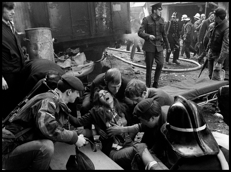
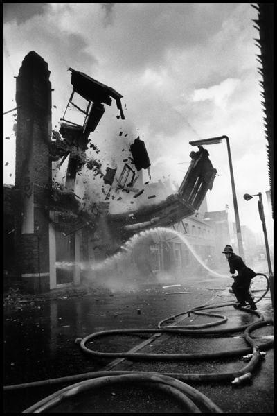
I choose Abbas because I found his photography interring and powerful. He was born in Iranian but resided in Paris. Abbas photography portrays a political message, he achieves this by capturing poignant moments. His war photography isn’t necessarily graphic but it still tells the story of the violence and tragedy. Some of my favourite work of his is the collection on Northern Ireland. I really enjoy how he does not work in colour and lets the captured black and white imagine do the talking. The Northern Ireland collection applies to me because of how local it is to me. It captures a side of history in Ireland that is spoken about with very hushed whispers.
The main ideas behind this article is to show how unfairly treated African photographers and journalists are. Western media corporations regularly overlook the work that African photographers and journalists are producing. If there are ever stories in the media about Africa they are usually from a Westeren point of view. This can lead to the stories exploiting false Africian stereotypes and having a very biased outlook on the situation. Stories can often group the whole continent of Africa under umbrella terms, like the starving Africans or the poor vulnerable African desperately trying to flee their war torn country. Articles have portrayed these people as savage and inhuman.
Another major problem with photojournalism in Africa is how undervalued they are within the photography world. African photographers and journalists are not held to the same standard as ones from Europe and America. African workers would be paid significantly less than their European counterparts. The view with the Africian photographers is that they aren’t as well trained and the quality of work they produce is unfinished and inadequate.
Overall this article gives very good insights to the inequalities between the Western world and Africa. It demonstrates that there is systematic racism present in the media world and that there needs to be something done to bridge the gap.
The story that affected me the most was Greg Marinovich in Soweto in 1990. This story accompanied by the photo really stood out to be because of the brutal actions of the men in the photography. It was captivating to hear how Marinovich reacted to this situation. You’d see these sort of war and conflict photographs constantly but you never think of what it feels like to capture theses photos. It is also inhuman what theses photographers are doing. They are not intervening or trying to stop the conflict they are simply documenting moments for history. It was powerful to hear how he felt capturing these images being so scared for his life but allowing himself to be so vulnerable for a photograph. It seems almost ridiculous to risk you life for something so simple as a photo. However they know the true power of photography and what a picture can do.
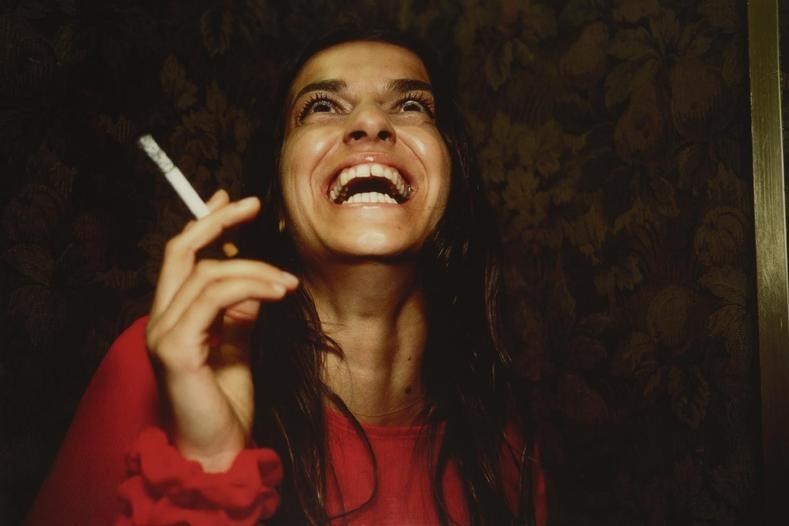
Nan Goldin appealed to me because of her chaotic style of photography. Her photographs remind me of scenes from the roaring 20’s in America. They look similar to the screen grabs from movies such as The Great Gatsby. Whereas these parties were showing lavish wealth Goldin’s photography portrays a more realistic and relatable side to this party lifestyle. Such as this photograph.
To me this photograph has a euphoric feeling. I was drawn to this image because every subject in the picture has a completely different expression on their face. The sheer joy on the woman in the foregrounds face is a stark contrast to the almost pissed off expression of the woman in the background. It made me question the relationship in which Goldin had with the subjects.
What I had noticed the most when researching Nan Goldins portraits was that the subjects were either enthusiastic and extremely happy within the environment that they were being photographed in. Like the above example of a young woman seen laughing at something perhaps a joke. You can see the sheer joy in her eyes, to me it looks like Goldins caught her mid laugh.
Whereas this portrait is a complete contradiction as to what is going on in the top image. You can see the pain in the women’s eyes and you can visibly see that she has been crying. I think Goldin is such a talented photographer because she is able to convey a wide range of emotions throw her subjects.
Growing up by the sea has impacted my views of the ocean and ocean activities greatly. While many people fear the ocean and what lies beneath it, I see great beauty within it. Being near the ocean can stimulate all of your senses. Not only do you visibly see the colours of the waves and the contrasting colours of the boats but you also hear the calming sounds of water lapping against the shore, the smell and the taste of the salty air, the cold crisp water on your feet. Every sense is being awakened.
I propose to show you this through the medium of photography. My main aim is to portray the natural beauty of the ocean to you and other people who may view my blog. I also want to try to capture the usefulness of the sea. For example the fisherman who make a living from working off the sea or showing the recreational use of the sea like the sailors, windsurfer and swimmers.
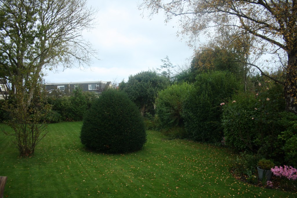
The beach and the harbour are the main locations I will be focusing on. These locations helped inspire the idea for this project so it feels right to focus my attention there. I aim to try and demonstrate the variety that the sea has to offer. To show the glorious sunny days, the dull and damp days and night and day. This will help show the contrasting scenes that the sea has to offer but also demonstrates how all these different times and weather are equally as beautiful. I will be taking all these photos with my canon EOS 1000D. I have not yet decided if I will be presenting my photographs in black and white or in colour. That will be something I decide once I begin editing.
As I’ve mentioned above my rationale for choosing this topic for my project is because I was lucky enough to live by the sea my whole life and I wanted to share this experience as best I could.
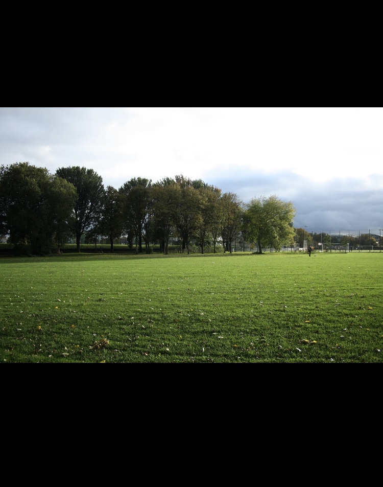
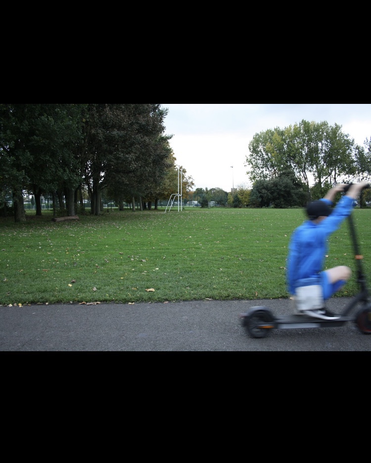
Shallow depth of field Great depth of fieldSlow shutter speedFast shutter speed Panning
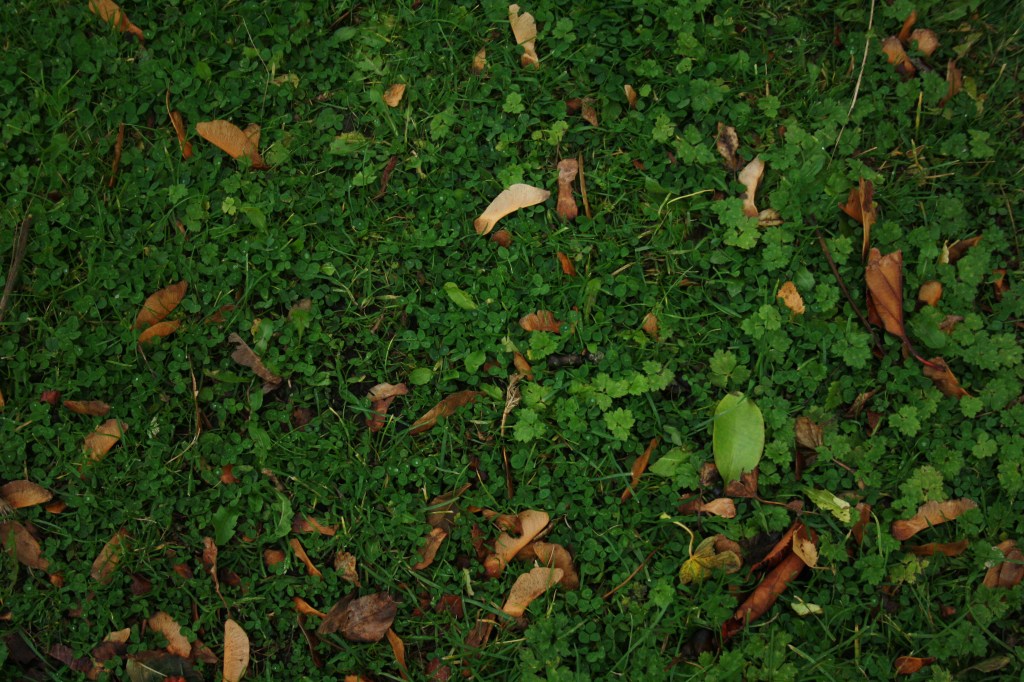
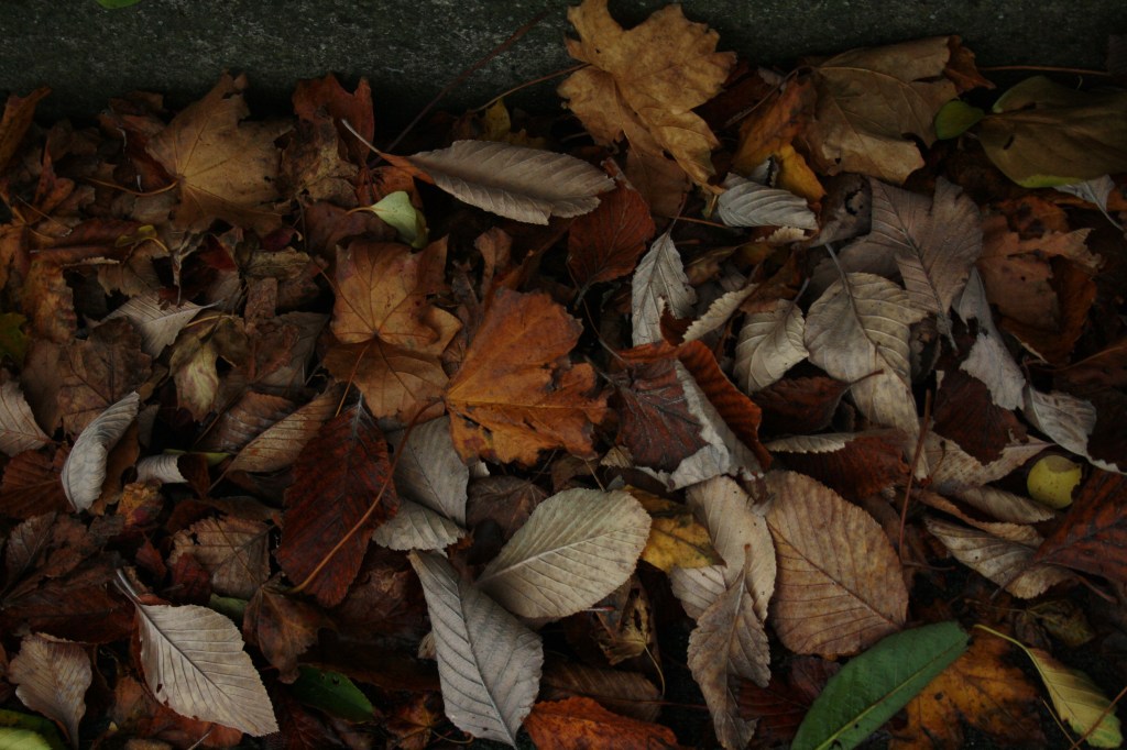
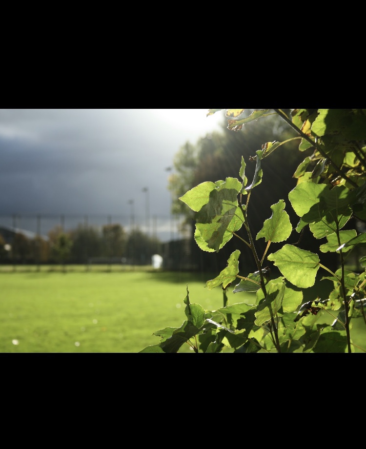
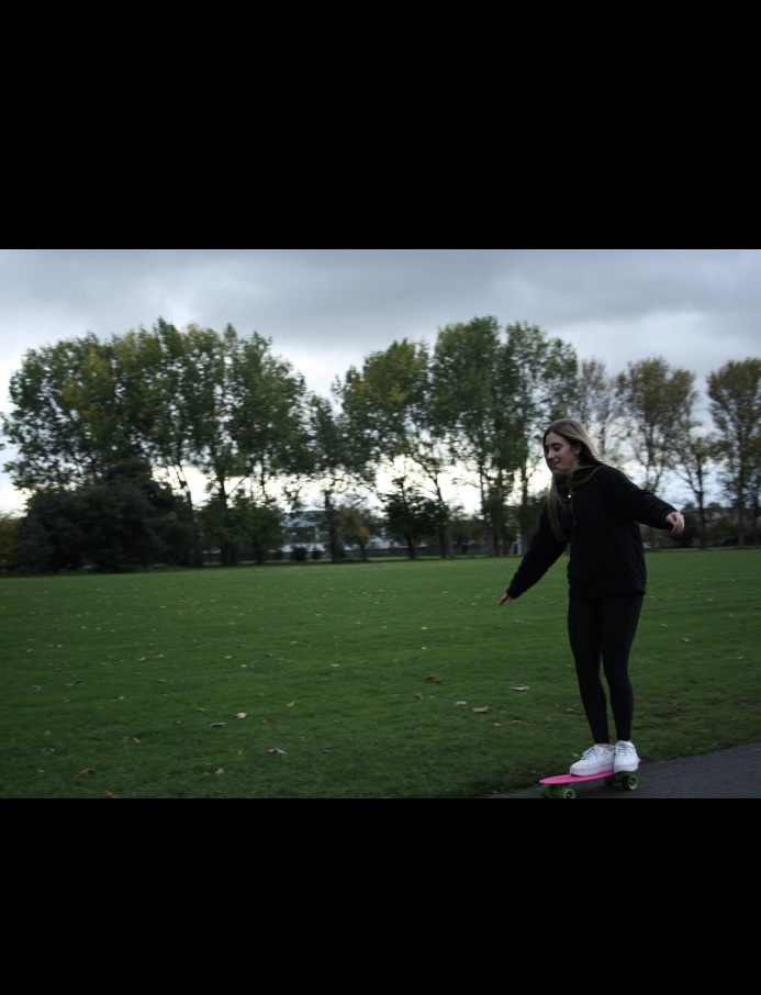
1. I achieved the shallow depth of field picture by setting my camera to Av. I set my camera to 1.25. I zoomed in on my object which was the leaf and made sure the background was still visible.
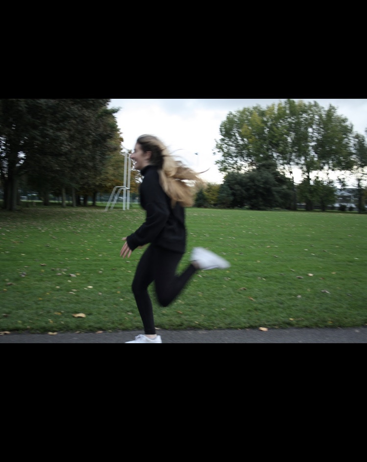
2. To achieve the panning effect I firstly set a slow shutter speed around 1/40. I set my camera to a continuous shooting mode so it would allow me to capture more pictures. I tracked my subject as she went by and made sure to keep as stable as possible.
3. ISO within cameras measure the cameras ability to capture light.
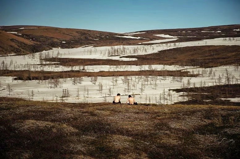
I find this photo very powerful. To me it represents unity and strength. The men are holding one another which symbolises support. This image is stunning due to the stark landscape of rural Russia. The two subjects in the picture nearly blend into the background. The earthy tones contrast dramatically with the bright blue sky above. This picture depicts a family at a lake. This image shows a happy scene. The colours are muted which allows your focus to go towards the subjects of the picture.